Summary
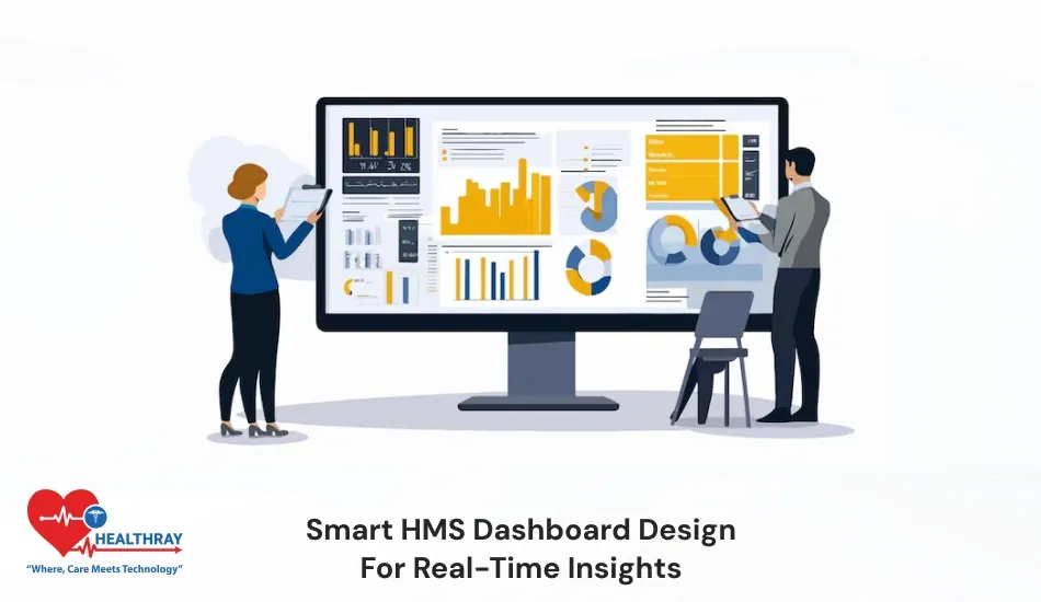
The primary goal of a well-designed HMS dashboard is to convert complex data into easy-to-read formats and provide management with accurate and useful statistics. In this blog, I’ll discuss how a smart HMS dashboard design presents all hospital data in an understandable and actionable format, allowing hospital executives, doctors, and the finance management team to make practical and concrete strategic decisions.
Introduction
In 2026, simply collecting data is insufficient for healthcare facilities. Real value comes when hospitals use that data to convert it into meaningful insights. Traditional hospital management software includes data, but they are mostly scattered. This makes it difficult for hospitals to interpret useful information from it. Scattered data slows down the decision making and many times healthcare facilities overlook critical opportunities.
Nowadays, hospitals should not just primarily concentrate on operational effectiveness; however, they should also work on evidence-driven strategies as well. Smart HMS dashboard design enables real-time tracking such as live patient flow, ALOS trends, NCR performance and A/R status. This helps hospitals easily identify issues and take concrete action right away. They no longer need to wait for monthly reports. When hospitals design their dashboards strategically, dashboards are more than just data collection applications. It becomes a dynamic framework that optimizes effectiveness, revenue and patient quality of care.
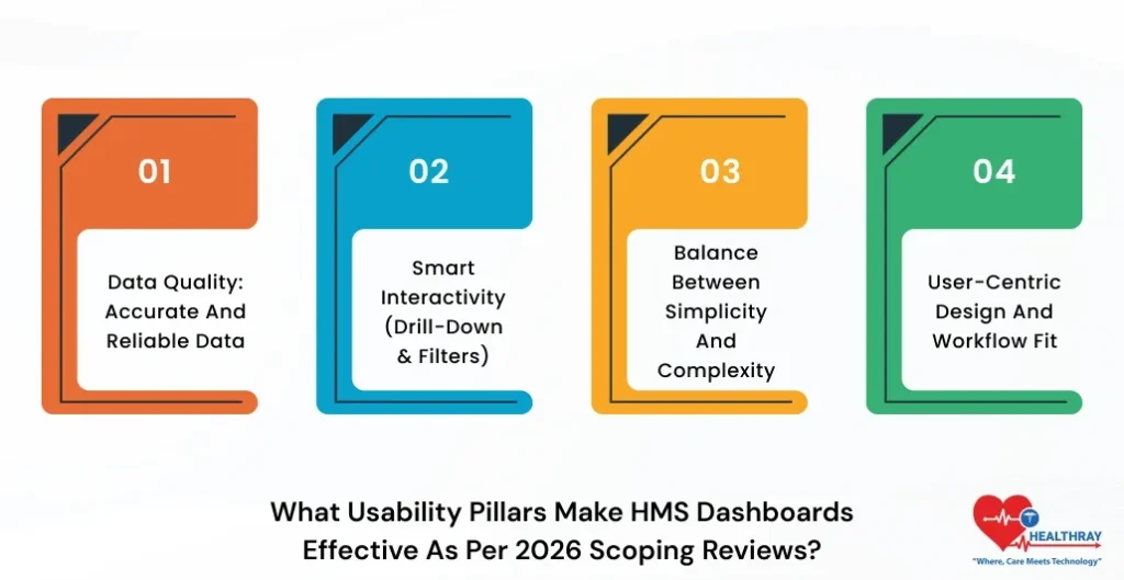
What Usability Pillars Make HMS Dashboards Effective As Per 2026 Scoping Reviews?
Let’s look at some usability pillars that make smart HMS dashboard design more efficient:
1. Data Quality: Accurate and Reliable Data
A smart HMS dashboard’s fundamental foundation is reliable data quality. Furthermore, hospitals should make sure that their data is accurate ,complete and updated. If data is wrong or outdated, it will directly impede the decision-making and eventually weigh down the performance.
2. Smart Interactivity (Drill-Down & Filters)
A Smart HMS dashboard design should be interactive. Moreover, users can conveniently drill down to check the details or they can even apply filters. For example, hospitals can comfortably evaluate both department-wise revenue and doctor-wise performance.
3. Balance Between Simplicity and Complexity
A more interactive dashboards can sometimes create overload. That’s the reason dashboards’ designs should be simple and role-based. Doctors should get quick insights and admins possess the ability to measure detailed analytics without creating any uncertainty in the practices.
4. User-Centric Design and Workflow Fit
A dashboard is effective only when it is smoothly aligned with the actual hospital workflow. Further, hospitals should involve end-users (doctors, admins, and the finance team) to improve both usage and performance in the practices.
How Does User Engagement Improve HMS Dashboard Outcomes?
1. User Engagement Real Impact
Hospitals should involve end users in the smart HMS patient registration dashboard design process. Moreover, when clinicians, nurses and admins provide input. This helps management to construct dashboards as per their real necessities.
2. Co-Design for Better Relevance
Through workshops and prototypes, users can validate and confirm performance indicators (KPIs) such as waiting time and billing delays. Moreover, this avoids irrelevant metrics and dashboards are able to solve real hospital problems.
3. Higher Adoption & Usage
When a user becomes part of the smart HMS dashboard design, this raises their ownership interest. Moreover, this elevates the dashboard adoption to a 2x level and staff can proactively apply it for making sound decisions.
4. Improvement from Iterative Feedback
Continuous evaluation feedback loop essentially reinvents the dashboards. Further, hospitals should design visuals, filters and layout according to user requirements. This improves usability and circumvents confusion and data overload.
How Does the Data Quality Pillar Enhance HMS Dashboard Effectiveness?
The main focus of the data quality pillar is to ensure that the data displayed on dashboards is dependable, accurate, comprehensive, and up to date.
1. Accurate Data Help Better Decisions
Hospitals will be fully equipped to make pragmatic decisions that result in favorable outcomes only if HMS dashboards display accurate and dependable data, such as bed occupancy, patient vitals, and billing. Moreover, wrong and inappropriate data results in poor execution of decisions and misallocation of assets. Also, read our blog on Data backup and disaster recovery in HMS to learn more deeply about it.
2. Clear Visualization Reduces Cognitive Load
By displaying high-quality data in simple visuals such as pie charts, graphs, and bar charts helps users to easily understand the insights. Further, users can easily spot anomalies such as high A/R days and low occupancy and can take immediate action on that.
3. Data Consistency & Integration
Hms dashboards collect data from multiple systems (EMR, billing, and inventory). Moreover, the data quality pillar ensures all the data should be consistent and synchronized with the medical practices.
4. Error Reduction & Better ROI
High-quality data prevents billing lapses, claim concerns and reporting errors in the system. Further, this improves the revenue cycle; hospitals get more favorable ROI and also they can indulge in more concrete approaches.
Interactivity Techniques That Boost HMS Dashboard Convenience
Interactivity in HMS dashboards empowers users to explore the data deeply. This breaks down the complex information and the user can derive valuable insight without taking the load of any additional tedious tasks.
1. Hover Tooltips & Real-Time Alerts
Once the user hovers, they can view additional information. For example, they can easily predict the reason behind billing spikes. HMS dashboards instantly notify real-time alerts (overcrowding, high A/R) . This approach helps management take powerful action immediately.
2. Mobile-Friendly & Easy Navigation
Responsive design and swipe gesture features simplify mobile usage, highlighting the importance of professional web development services in creating user-friendly HMS dashboards. Further, breadcrumb navigation enables tracking all the features in depth.
3. Role-Based Interactivity Balance
Every user’s skill is different. Moreover, beginners require a simple view and experts require advanced options. This naturally strengthens both accessibility and user acceptance.
Why Should Hospitals Establish Drill-Down Features In HMS?
Drill-down features provide options to hospitals to fetch detailed insights from high-level data. Dashboards no longer just remain reports; they become problem-solving tools that can easily resolve real-life problems.
1. Identify Root Cause Immediately
If the dashboard displays 80% bed occupancy, then by using the drill-down feature, hospitals can easily analyze the department and ward-level data. This helps medical professionals analyze exact problems such as delayed discharge.
2. Faster Decision-Making
Doctors can view ER wait time and perform a drill-down to identify urgent patients. To make a decision more quickly and precisely, the administrator can examine denied claims features and A/R data.
3. Improve Patient Care
“Drill down” helps doctors to easily track treatment outcomes. Further, they can easily identify high readmission and delay cases for better care planning and timely intervention.
How Does AI Enhance Interactivity in Smart HMS Dashboard Design
In 2026, smart HMS emergency operations centre software dashboards become more interactive when integrated with AI algorithms. Moreover, these dashboards not only recognize but even provide high-impact suggestions to users.
1. Natural Language Queries (NLP)
Through AI , users can ask questions in simple language. For example, “Can I see the waiting time of last week?” Moreover, the HMS system will automatically apply a filter and present relevant data to users. They no longer need to depend on manual clicks.
2. Voice & Hands-Free Interaction
Voice-enabled AI tools provide effortless hand-free accessibility to doctors. Further, they can access data without the need to touch the screen while taking rounds of wards. This approach saves considerable time and creates a smooth workflow in the practices.
3. Personalized Dashboard Experience
Role-based features provide a personalized experience to medical teams. Admins can easily perceive revenue insights, nurses can view patient vitals, and every user benefits from a customized view.
4. Predictive & Smart Insights
AI conveniently accesses the past data and predicts future trends. For example, hospitals can easily take practical actions beforehand when there are warning signs of high bed occupancy.
Conclusion
A smart HMS dashboard design transforms all the intricate data of hospitals into clear and concrete insights. A well-designed dashboard should be based on four pillars–data quality, interactivity, user involvement and accessibility. These combinations ensure the dashboard should be intuitive and easy to use for all users. Iterative improvements, compliance and smart design help hospitals maximize their revenue.