
Summary
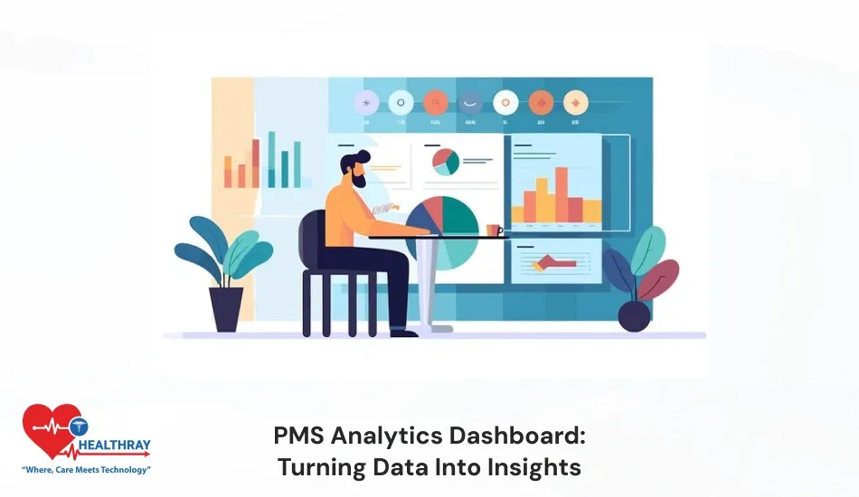
The PMS Analytics Dashboard allows pharmacists to easily track and analyze the entire system. In the traditional system, reading data seems complex. Through powerful analytics or AI-based visualization, a pharmacist can weigh the figures in just a split second. Instead of pulling data from countless spreadsheets, pharmacy executives and leaders get cutting-edge statistical information in a single dashboard. Pharmacists can easily analyze inventory outcomes, expiry uncertainties, sales inflation, or prescription patterns. In this blog, I will discuss how the PMS analytics dashboard helps pharmacists interpret plain data into informative discoveries. Also, I will cover how the analytics dashboard helps you make intelligent decisions during inventory planning and peak sales hours. Keep reading!!!
Introduction
In the modern pharmacy ecosystem, data is not just an operational output; it has become a strategic asset. Nowadays, collecting only data is not adequate; real value is acquired only when pharmacists are adept at sorting data and converting it into actionable insights. Pharmacy operation generates huge amounts of data daily, such as prescriptions, inventory distribution, patient buying preferences, and sales statistics.
If a pharmacist keeps this data scattered and in manual reports, decision-making takes longer. The PMS analytics dashboard is a good tool to use in order to combat such circumstances. Pharmacy management system dashboard works as a centralized intelligence layer and transforms raw pharmacy data into intuitive, visually appealing, and concrete insights.
More importantly, these dashboards are not just meant for data experts. User-friendly design, interactive charts, and customizable KPIs ensure both pharmacists and management can understand the insight without any technical complexity. Pms dashboard doesn’t just highlight figures. It showcases real business realities that make the pharmacy operations more successful, lucrative and geared toward patients.
Why Data Turns into Insights Here
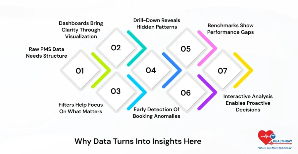
Raw PMS Data Needs Structure
The PMS system creates more than a thousand data points daily: inventory, stockouts, cancellations, maintenance reports, pricing variations, and patients’ desires. In traditional systems, this data is present in raw and unstructured form. Further, it becomes highly difficult for the team to analyze patterns and trends and build high-impact outcomes from those figures. Without proper structure, these data are just a number; pharmacists can’t take out meaningful information to boost revenue growth. Moreover, the structured format of data is crucial to pull impactful insights. This helps pharmacists make tangible decisions that elevate productivity.
Dashboards Bring Clarity Through Visualization
Analytics dashboard PMS for hospital pharmacies converts the complete and dispersed data into simple-to-navigate visuals such as charts, graphs, and heatmaps. Furthermore, through visual representation, pharmacists can easily navigate trends, performance deficits, and unusual variations. In the traditional system, pharmacists fail to acknowledge these important insights on spreadsheets and raw reports. As the traditional system provides ineffective and unordered data. Pharmacy software presents this data in a clear format. Helping pharmacy professionals effortlessly interpret observations. Overall, the team can now efficiently understand the data and make concrete decisions in less time.
Filters Help Focus on What Matters
PMS analytics dashboards provide filter options to users. Further, dashboards provide flexibility to users to narrow down their needs. Users can focus on relevant information by selecting parameters such as date range, medicine type, pricing tier, and category. Additionally, it filters out unnecessary data noise. Pharmacy can clearly view the analysis. When pharmacists get the right data at the right time, naturally decision-making will become dependable, confident, and pragmatic.
Drill-Down Reveals Hidden Patterns
High-level metrics provide a clear picture of the overall performance of pharmacy workflows. Further, the pharmacist gets real insights only when they are capable of drilling down the data deeply and analyzing it. Through the drill-down feature, the pharmacist can correlate users’ specific factors such as medicine category, booking source, price range, and seasonality. Moreover, pharmacists can easily find out the reasons for no-show rates and cancellations of medicines through this process. Overall, it helps the pharmacist take concrete action and circumvent future monetary losses.
Benchmarks Show Performance Gaps
Dashboards provide a clear reference point to compare internal accomplishments with industry standards. Further, this helps pharmacists easily evaluate whether benchmark revenues, inventory turnover, or compliance performance are strong or need priority for amendments. Benchmarks help pharmacists highlight performance gaps. Assist them in determining viable objectives. Overall, this transparency helps the team for more effective planning, market positioning, and continuous performance improvement.
Early Detection of Booking Anomalies
Dashboards can easily determine the sudden changes in medicine booking patterns in real time. The system automatically detects any unusual patterns. If direct booking suddenly drops or demand spikes, pharmacy software automatically sends notification messages. Pharmacists can timely take the initiative if they detect the problem in the early stage. Through these insights, pharmacists can quickly customize marketing campaigns, channel mix, and pricing strategies. Overall, inventory forecasting in PMS software allows the team to take concrete action before the revenue is subject to impact.
Interactive Analysis Enables Proactive Decisions
The dashboard provides the flexibility for interactive users to analyze data from multiple angles. Users can view region-wise and specific time period data. In a traditional system, it becomes difficult to collect data from different sources. Pharmacists can’t make accurate strategies to improve areas that still need attention. This flexibility allows teams to spot trends and risks beforehand. Proactive analysis simplifies planning and allows pharmacists to make timely decisions. It makes the operation workflow completely flawless and elevates overall performance and patient satisfaction.
 PRO TIP
Essential Components Breakdown
Core Visualization Types
Analytics dashboards are built on strong and appropriately selected visual elements. Further, when pharmacists use the right visualization, then it becomes easy for them to interpret complex data. They get powerful insights to make the workflows more accurate and efficient. Pharmacy software provides clear charts and visuals. Decision-makers take less time to understand numbers, which were difficult to comprehend in traditional systems. Overall, it helps pharmacy centers make instant, accurate, and more dependable decisions.
Charts and Graphs for Trend Tracking
The line chart in the pharmacy software accurately tracks time-based patterns such as seasonal customer demand, booking patterns, and occupancy shifts. It helps pharmacists understand the peak and dip point of performance. Through these charts or graphs, the pharmacist can compare different centers’ performance and see which region requires specific medicine. Thus, it helps professionals discover strengths and improvement gaps very quickly.
KPI Widgets for Instant Insights
KPI widgets dashboards include total sales, average purchase value, expiry rate, and prescription volume that demonstrate significant business figures in real time. Further, pharmacists can easily examine KPS. Trend arrows and indicators to help management understand whether performance is improving or heading toward decline. It helps management make quick decisions based on these numbers and take measurable action on areas that still need upgrades.
Heatmaps for Density Analysis
Heatmaps present the data in a color-coded format. This helps pharmacists easily recognize medicine sales, prescription volume, footfall density, and peak booking time frames. These visuals highlight which time slots, days, counters, medicines, and pharmacy centers generate maximum traffic and bookings. In a single glance, a pharmacist can identify performance hotspots. Thus, it helps professionals efficiently organize capacity advancement and resource distribution.
Gauges for Performance Thresholds
Gauges visually represent the performance against the target and threshold. This helps professionals understand if current metrics are working under a safe zone or have crossed the warning level. PMS analytics provide a quick clarity. Even without reading thorough reports, this aids the team in determining when to implement corrective measures.
Drill-Down Interactivity
Drill-down interactivity enables users to navigate detailed insights by thoroughly reading the metrics. The user just needs to toggle the charts and KPIs presented in the dashboards and easily break down monthly performance by daily data, medicine types, and booking sources. In the traditional system, users don’t get such comprehensive information about essential parameters that are the foundation of growth. With pharmacy software, you can easily determine the actual reason behind the surface-level number. Pharmacists can use this data to strategically plan their approaches and stay vigilant about their next actions. Overall, this makes the decision-making more reliable and premised on data.
Smart Filters for Flexible Analysis
Smart filters provide flexibility to the user to narrow down the data as per their business needs. Further, pharmacists can analyze the relevant information, such as date range, patient demographics, region, etc. This maneuverability makes the evaluation more precise. Removes unnecessary data and provides more relevant insights to pharmacists.
User-Friendly Navigation
A well-designed dashboard comes up with simple navigation. This helps the user to evaluate the features even without the need for taking training. A clear layout expedites the decision-making and allows professionals to emphasize relevant aspects that need maximum awareness. Also, read our blog on AI chatbots for pharmacies to know how chatbots can help patients to resolve their routine queries.
 NOTE
NOTE
Advanced Analytics Integration
Moving Beyond Descriptive Analytics
A traditional dashboard only displays the past histories and patterns. However, advanced analytics elevate the PMS data to the ultimate level, where the pharmacist can focus on the next action and prepare strategies to work on that.
Predictive Demand Forecasting
The machine learning model deeply analyzes weather changes, local epidemics, and seasonal variations along with analyzing past data. Moreover, this helps pharmacists and healthcare providers to accurately plan inventory and staffing.
IVR and Automated Refill Reminders
IVR systems send automatic refill reminders and medication notifications to patients. Further, this improves adherence and allows patients to follow the healthcare regime consistently. Overall, it makes the treatment outcome better.
EHR/EMR Integration for Patient Context
Through EHR and EMR system integration, pharmacists can instantly access complete patient history. Furthermore, this makes the prescription safer, avoids duplication, and makes the clinical decision more tangible.
Conclusion
Pharmacy analytics dashboards deliver operational effectiveness and control over every scale. Analytics clearly displays which medicine is moving fast and slow. This significantly reduces overstocking and expiry losses. Daily pharmacy data that seems overwhelming, PMS dashboards convert it into crystal-clear visual insights and allow pharmacists to take concrete actions.