Summary
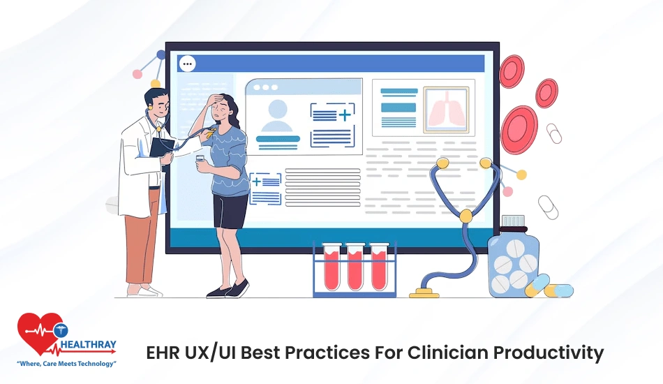
This article describes how strong EHR UI/UX optimization speeds up, simplifies, and adds a measure of safety to daily clinical work. It shows how clean layouts, quick taps, clever alerts and simple forms enable clinicians to be more efficient and less frazzled.
It also notes how mobile friendliness, personalization and actual testing with real users lead to more comfort and speed. These advancements make the EHR software easier to use and contribute to better care, improved accuracy and increased workflow efficiency. Overall, the article says that every clinic should be thinking about how to improve EHR UI/UX because it affects clinician productivity and patient outcomes.
Introduction
Clinicians work fast every day and need tools to support that speed. But many screens also slow them down. So smart design matters a lot. With strong EHR UI/UX optimization, you give clinicians clear paths, quick actions, and smooth flow.
Besides, good EHR software eliminates confusion and extraneous steps. As a result, clinicians spend more time with patients. Also, simple layouts guide them through the work without requiring much thought.
Better graphics, simpler menus and crisp forms also alleviate everyday annoyance. And when everything stays simple and easy, clinicians feel calm and confident. So, when you focus on EHR UI/UX optimization, you build a EHR system that really supports fast, safe, and happy care.
What’s EHR UI/UX Optimization?

EHR UI/UX optimisation refers to arranging EHR software screens to facilitate rapid, easy work. Specifically, it means you declutter, eliminate clicks, and guide the clinician by providing clearly defined paths. Consequently, the user sees only what they need and when they need it. This is good for speed, focus, and quality of care.
Furthermore, EHR UI/UX optimization results in straightforward interfaces that align with actual clinical workflow. In addition, it keeps buttons clear, forms short, and menus within reach. As a result, clinicians have less downtime looking for tools or data. Moreover, they are comfortable and confident with tasks.
EHR UI/UX Optimization: Best Practices for Clinician Productivity
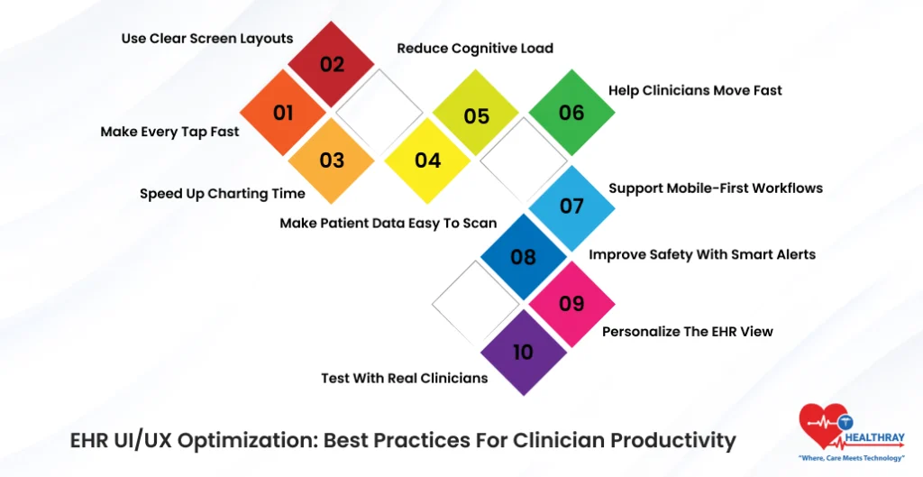
Below are the best practices for strong EHR UI/UX optimization. These steps help clinicians move faster, think clearer, and work with less stress. And they support real productivity gains in every clinic.
#1 Make Every Tap Fast
On each visit, speed is essential. Consequently, clinicians whipsaw from one task to another and thus need toolsets that allow for similar rapidity. EHR UI/UX optimization must eliminate unnecessary taps, long tap paths, and slow loading times.
In addition, taps should feel quick and crisp. Clinicians’ energy and focus can also be sapped when screens lag. Moreover, slow paths increase frustration and delay care. Speed, therefore, becomes a design principle.
Furthermore, keep common tools in one easy place. Always keep orders, notes, and vitals close. Additionally, add one-tap shortcuts for everyday tasks. Also, don’t have deep menus that require endlessly revisiting previous pages. Simple paths are time savers and reduce mental stress.
Moreover, get rid of the slow pop-ups and heavy animations. These effects may look good, but they slow down action. Thus, make your transitions smooth and light. Furthermore, always test screens on slow networks as well. Your EHR software solutions should still work even in areas with weak Wi-Fi, like in real clinics.
It is also useful when training new employees during an EHR demo & free trial guide. When taps are easy and fast, users learn the system faster. As a result, they feel safe to explore features because nothing feels heavy.
#2 Use Clear Screen Layouts
Clinicians think quickly. Therefore, they scan screens in seconds and want clear direction. Moreover, messy layouts slow them down and drain their mind. Consequently, with EHR UI/UX optimization, you keep screens clean, bright, and simple.
To begin with, put important tasks at the top. Additionally, display urgent items to users first. Furthermore, use plain language. Also, remove duplicate fields that confuse the clinician. In this way, display only what is important at the moment and not everything simultaneously.
Moreover, be generous with spacing. In fact, spacing helps avoid eye strain and aids in reading. Likewise, do alignments on all screens consistently as well. When properly aligned, the screen appears stable and tranquil.
Furthermore, transparent screens support safety as well. Notably, a clean structure yields fewer missed alerts and wrong clicks. Even at the busiest of times, clinicians can quickly find critical data.
At last, a simple layout builds instant trust during the EHR demo & free trial guide. As a result, users feel comfortable and confident immediately.
#3 Speed Up Charting Time
Charting eats up enormous amounts of time in every clinic. Consequently, clinicians type for hours, and long charting sessions lead to burnout. Therefore, EHR UI/UX design must make charting speedy, buoyant, and seamless.
For this reason, use smart templates for common conditions. These templates provide shortcuts for typing and increase accuracy. Additionally, include autofills for allergies, vitals, and past notes. Moreover, let people record voice notes for quick entries. This is a time saver as well, since many clinicians talk more quickly than they can type.
Furthermore, keep fields short. In fact, long forms kill speed and foster frustration. Conversely, short, focused fields make for easy and clear charting. As a result, simpler forms increase accuracy because there is less confusion on the part of the clinician.
In addition, divide larger tasks into smaller tasks. Also, use progress bars to orient the user. These little things enhance comfort and reduce stress.
This step also boosts the clinic’s results in an EHR ROI calculator & cost models. Indeed, quicker charting leads to better billing, decreased backlogs, and better documentation. Consequently, better charts also reduce claim denials.
Overall, good EHR UI/UX optimization makes charting feel light, smooth, and fast.
#4 Make Patient Data Easy to Scan
The data is rapidly scanned by clinicians at each visit. Consequently, they look for patterns and key values, as well as red flags. Thus, EHR UI/UX optimization must cater to speed in reading and in thinking.
Use bold headings for each group of data. Furthermore, make plenty of white space between sections. Additionally, highlight key values such as vitals, labs, and allergies. Ultimately, such modest focus makes reading more secure and speedier.
Also, box data that are related to each other. For instance, keep vitals together. In the same way, keep labs together. Moreover, consolidate your notes in one obvious, accessible place. When the related data lie close together, clinicians grasp the story more quickly.
Avoid heavy colors that stop the eye. Instead, use only 2 or 3 simple tones. In contrast, excess color is distracting. Therefore, quiet colors help quiet eyes and a quiet mind.
Additionally, place the alerts close to the data with which they are related. In this way, dodge decontextualized alerts. As a result, alerts that are near cause less confusion and help quicker action.
Overall, excellent EHR UI/UX optimization should allow clinicians to view the information they need at the precisely correct moment without any frustration.
#5 Reduce Cognitive Load
Clinicians have a lot on their minds. They deal with complicated decision-making, long timelines and high-stakes work. Thus EHR UI/UX design must shield that focus and decrease mental pressure.
One task should be displayed in one screen. Keep different tasks out of the same space. Shorten long blocks of text. Long text slows the mind and induces errors. Use simple meaningful icons. Such icons lead the user by not requiring additional thinking.
Also, eliminate noise such as extraneous buttons and fields, and options that are easily confused. Each additional element siphons off a little energy. Eventually, that waste begins to weigh down.
Divide longer tasks into shorter steps. Simple instructions focus the mind and decrease stress. Incorporate visual indicators of progress. Such signals make users feel in control.
#6 Help Clinicians Move Fast
Clinicians feel strong and in control when they fluidly shift from task to task. EHR UI/UX optimization must therefore accommodate speed of action.
These should also include keyboard shortcuts for common functions. Quick keys take seconds off each chart. Add swipe gestures for mobile screens. Gestures are helpful in rounds and bedside.
Use auto-advance for common flows, such as vitals entry and note steps. Also, place taps close together. Don’t use deep menus. Deep menus generate friction. Use three menus that open in one motion.
This smooth flow keeps the clinician concentrated and calm. It also increases adoption of EHR software solutions.
#7 Support Mobile-First Workflows
Clinicians work everywhere. They float from room to room, department to department, patient bed to patient bed. This is why EHR UI/UX optimization must also improve for robust mobile-first workflows.
Use big buttons to allow for easy tapping. Little buttons create mistakes on the run. For extensive lists, make sure to use simple scrolling paths. Don’t have nested drop-down menus. On mobile, keep forms short.
Also, test all screens on small devices first. If it works on mobile, it works anywhere. It guarantees that there are no simple paths for the whole system.
Mobile support also increases flexibility and speed. It helps clinicians update the charts during rounds. It clears backlogs down the road. And it enhances bedside care because clinicians immediately access real time data.
And in an EHR demo & free trial guide, mobile ease is a major selling point. Strategic enhancement of the HR UI/UX optimization will create a contemporary, adaptable and mobile-friendly workflow.
Step towards digital era with our healthcare solution
Revamp your hospital facilities and embrace change for better healthcare management. Ease in managing and organizing large medical datasets leads to effective analysis. Seize the opportunity now!
#8 Improve Safety with Smart Alerts
Alerts are designed to guide care and protect the patient. But too many alerts create noise and stress. So EHR UI/UX optimization must make alerts intelligent, intuitive, and informative.
Display only important alerts. Minimize trivial distractions. Use basic colors for alert types. Bright colors attract attention when desirable.
Put alerts on adjacent fields. This helps with comprehension and wrong clicks. Also give users options to tone down unnecessary alerts. Personal control diminishes frustration.
Smart alerts make things safer, without noise. They promote calm care even in the pressure cooker moments.
#9 Personalize the EHR View
Every clinician has his or her own way of working. EHR UI/UX optimization also must support personalization.
Allow users to move blocks. Let them mix the order of the layout. Let them save favorite tools. This builds familiarity and decreases search time.
Provide keyboard shortcuts for tasks. Personal shortcuts help speed and fatigue on a daily basis.
Such personalization also increases EHR software solutions’ being adopted. Clinicians trust it more “if clinicians feel it is their tool”.
Personalization also yields better results in an EHR ROI calculator & cost models, because faster work leads to increased value.
#10 Test with Real Clinicians
Real clinical tasks must be part of EHR UI/UX optimization. Have clinicians pilot screens in real cases. Pay attention to their flow. Acknowledge each struggle. Address each point of pain as quickly as you could.
Include nurses, doctors, support staff. Each group has different needs. The two groups have different problems.
Also use testing during the EHR demo & free trial guide stage. This phase provides honest feedback and creates trust.
Conclusion
Good EHR UI/UX optimization takes lag and chaos out of the provision of care. It supports clinicians with simple screens, fast paths and clean layouts. In addition, it increases EHR software solutions adoption and enhances the returns reflected on an EHR ROI calculator & cost models.
Also, good design builds comfort during an EHR demo & free trial guide, because one understands the tools more quickly. Most importantly, EHR UI/UX optimization keeps clinicians focused, calm, and confident in their daily work. Every clinic should care to invest in good design that serves real human needs.